Exercise:
- Graph the f(x) = x² function and its derivate on the [-2,2] domain!
- PRACTICE: Graph the f(x) = ax² + bx + c function and its derivate on the [-4,4] domain! The values of parameters a, b, c have to be variable.
Preliminary remarks
Excel allows us to plot functions given by mathematical formulae using the diagram function. The program can place points with their coordinates in the coordinate space and then connect these points (e.g. with straight lines).
Function visualization in Excel is always done by defining in some way discrete points where you can evaluate the function. Types:
- Explicit function: the function is given by y = f(x), so we can express y from x. In this case we can take discrete values of x, for which we can compute y by substitution.
- Implicit function: y and x cannot be expressed in terms of each other, for example, an x may have two y's. In such a case, a possible solution is to introduce a new parameter in relation to x and y can be explicitly expressed.

The functions given in the exercise are explicit functions, so it will be sufficient to take discrete x values in the domain [-2,2] and compute the y values by substitution. Which means that the yi associated with xi can be obtained as follows: yi = f(xi).
We now perform the derivation analytically, using the methods learned in high school:
- f'(x) = 2x
- f'(x) = 2ax + b
Exercise 1: f(x) = x²
Calculation of function values
Given the above, we need x values, and then for each x we need to evaluate the functions f(x) and f'(x). Let's create three columns, so each row will define a point from each function.
- Let's create column headers: in cells B2, C2, D2 we write x, f(x), f'(x) in order.
- Enter -2 in cell B3 and -1.8 in cell B4. Then select both cells, and click on the square in the bottom right-hand corner of the selection and drag the formula downwards until the number sequence reaches 2.
- In cell C3, evaluate the function at the location x defined by cell B3. This is done by substituting the function f(x) into the formula by referring to cell B3 where x is in the formula:
=B3^2. - In cell D3, evaluate the derivative of the function in a similar way:
=2*B3
For now, we have evaluated the functions at one point. In the next row we want the formulas to refer to cell B4 instead of B3. Since there are relative references in cells C3, D3, copying the formulas down will also shift the references down.
- Select cells C3-D3.
- Double-click the square in the bottom right corner of the selection or drag down to copy the formula.
Illustration
You can plot both functions on a diagram. Excel can automatically identify your data and create the charts. Let's try automatic charting first.

- Select all three columns together with the headers.
- In the Insert menu choose the "Scatter with straight lines and markers" type.
HINT: For quick and precise selection, click in the top left corner (B2), hold down the shift+ctrl keys, and then use the right and down arrows on the keyboard to select the range. Holding down the shift key ensures that the selection continues, and with the help of the ctrl key we can navigate to the edge of data-containing areas.
If the data is not automatically recognised, you can manually assign it to the chart. You can also modify the existing (wrong) chart by deleting or correcting the incorrectly added data series.
- Stand on an empty cell, then in the Insert menu select "Scatter with straight lines and markers". This will create a blank chart.
- Right-click on the chart and select the Select data option.
- Click + to add data series to the chart. To edit fields, first click in the field and then select the appropriate cells in the chart.
- The "X values" field should refer to the x values, the "Y values" field to the f(x) values, the "Name" field can be a reference or you can enter the name of the data series in text. Refer to the cell of the header (C2).
- Use the same method to create a new data series, except that in the "Y values" field we need to refer to the f'(x) values and in the "Name" field we need to refer to the D2 cell.
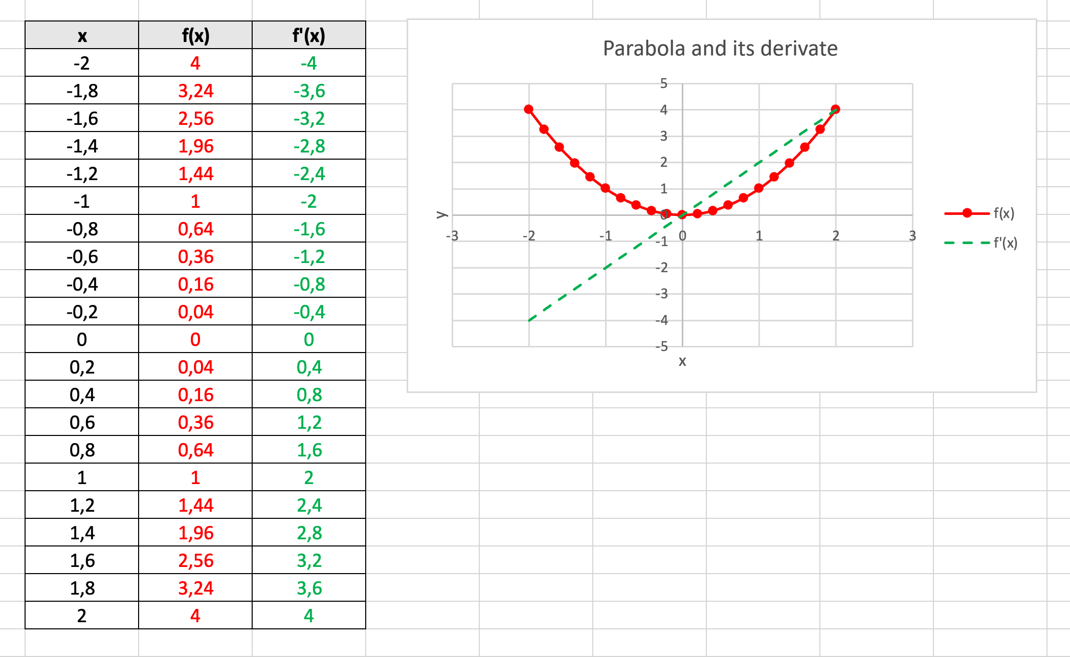
All that remains is to place labels on the diagram and format the final result.
- Select the chart, then in the Chart Design - Add Chart Element - Axis Titles menu, add horizontal (x) and vertical (y) axis titles. Double-click on the caption that appears to rewrite them.
- If not created automatically, add a legend in the Chart Design - Add Chart Element - Legend menu.
- Add a Chart title in a similar way.
- Right-click on an empty part of the chart and select Format chart area. A menu opens on the right, the contents of which depend on which element is currently selected on the chart.
- Format both the diagram and the table according to the illustration.
Exercise 2: f(x) = ax² + bx + c (practice exercise)
Start a new Excel document or a new tab for the second exercise. In order for the values of a, b, c to be variable, we need to include them as parameters in a separate cell.
- In cells B2, B3, B4 enter "a =", "b = ", "c = ".
- Write arbitrary values in cells C2, C3, C4, and then name the cells a, b, cc.
HINT: In Excel, you cannot use any name to name the ranges, for example, "c" and "r" are reserved by default, so we will use the name "cc". If a name is taken, we do not get an error message, the renaming just simply doesn't happen.
The exercise continues from here in the same way as before. In the formulae f(x) and f'(x), we can refer to the cells a, b, cc by their names.
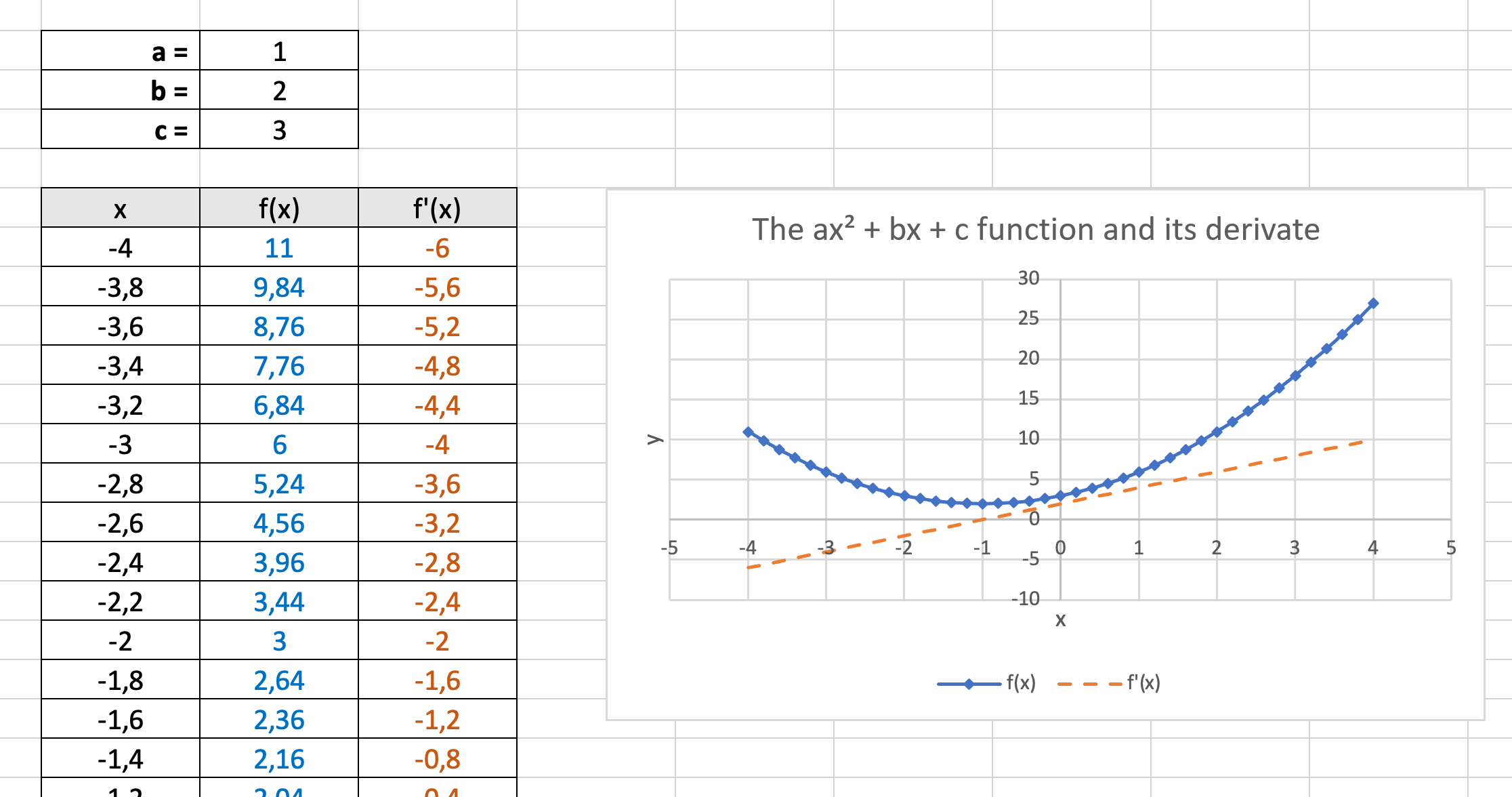
HINT: How can I make the number 2 in the chart title appear in the superscript? In places where we don't have formatting options, we need to insert the superscript 2 as a symbol. If there is no symbol insertion option in the program, you can look for the required character in another program (e.g. Word) or on the Internet (by searching for "superscript 2" in Google).